SURGE INSTITUTE
IGNITE. FUEL. TRANSFORM.
OVERVIEW
The Surge Institute (Surge) began as a grassroots movement, seeking to carve out spaces where leaders of color (particularly in educational settings) could create transformational change in their communities.
OBJECTIVE
As Surge entered its second decade, this space-making entity had become more advanced, offering nearly a dozen programs and initiatives, and required a new brand strategy that reflected their growth.
RESULTS
The new brand strategy and identity system increased program participation and donor giving.
WORK
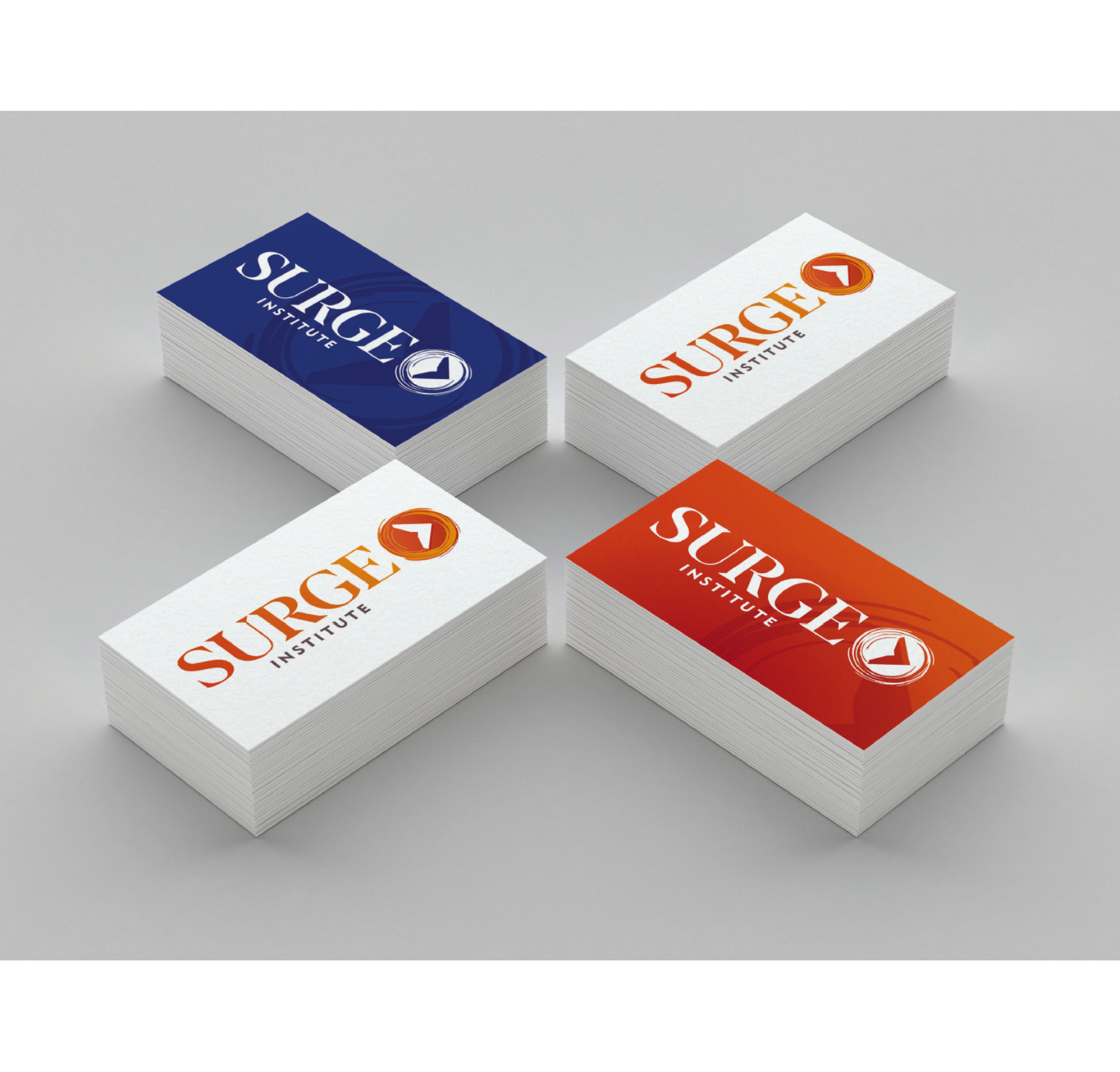
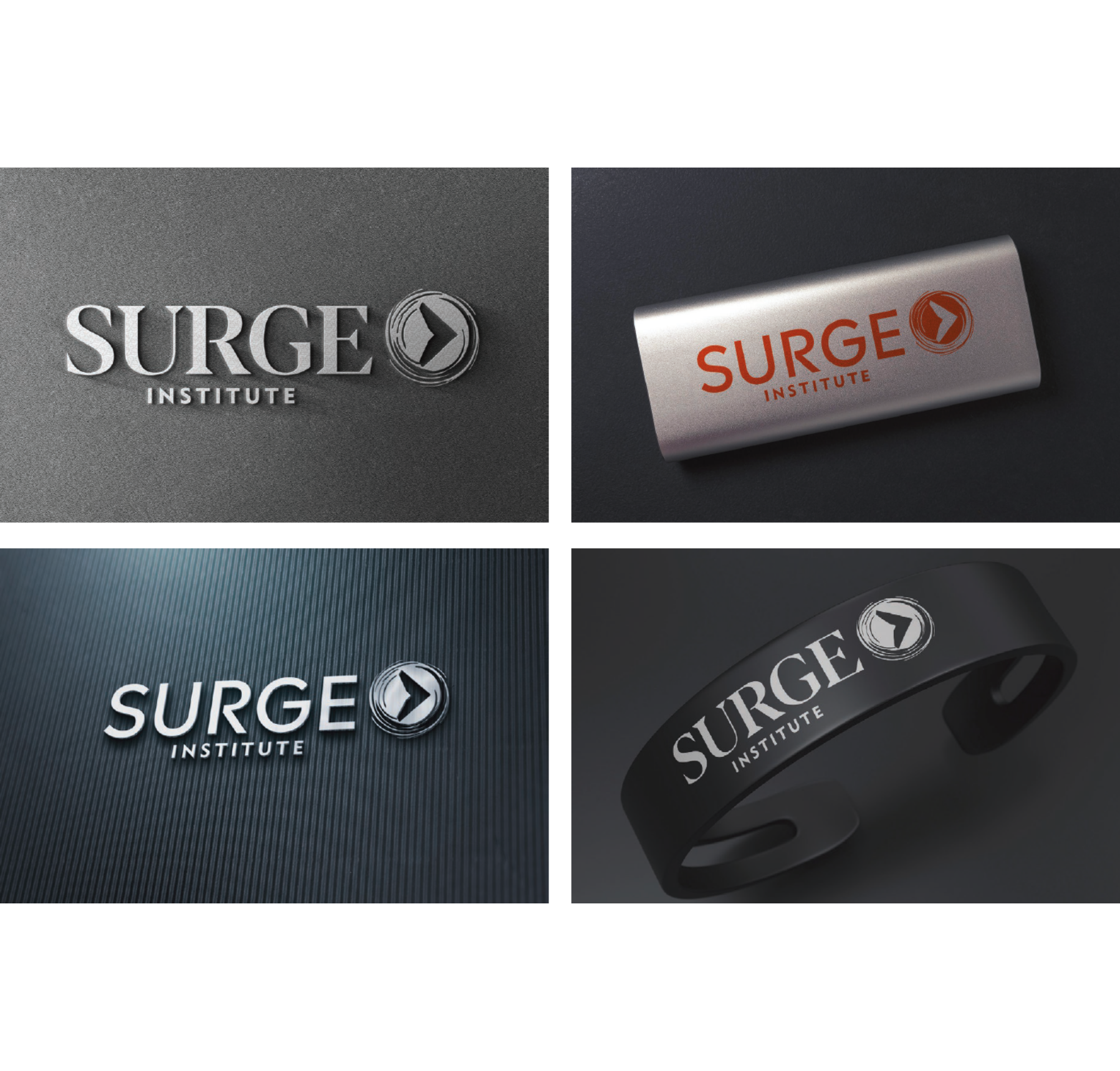
The new logo is bold and distinctive. The colors transform from a deeper red to brighter shades of orange and yellow to reflect the organization’s ongoing transformation. The brandmark reflects a progressive and collaborative movement – individuals and communities working together and changing together. The logo is also versatile. Brandmark and font can be used together, separately, and as anchors for adjacent initiatives. Finally, the creative package is easily transferable and readable across varied platforms.